In a previous post, I described how to format typical physician productivity data to enable further analyses, finding useful insight. I dig deeper to find more actionable insights in this post.
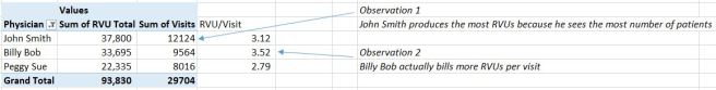
Refresher: we had office visit data for 3 doctors over 2 month period; we added RVUs to the office visit procedure codes; we added day of week, and other time dimensions. We found that Peggy Sue billed the least RVUs, while John Smith billed the most RVUs, and Billy Bob billed the most per visit.
Let’s pick up from there. Please download worksheet here.
Previously, in step 3 of the data formatting, we added the day of week in the data input tab, using Excel function “=WEEKDAY(B4)”. Let’s see what that can reveal of the doctors’ practices.
Going back to the pivot tables on the [analysis] tab, we can create this view of the pivot table, with day of week as the columns. (Basically, you drag the WeekDay variable from the top into the columns)
Notice that Billy Bob is actually working a lot less on Thursdays and Fridays? You may indeed find out that Billy Bob also teaches students on those days, so work fewer hours in the clinic. Knowing this will prevent you from doing unfair benchmarking across different physicians.
Next let’s see what we can find out about the doctors’ billing patterns.
The pivot table can be restructured as such: dragging the “Procedure code” variable in the column space and leaving only the sum of Visits in the Values space.
You can see that Peggy Sue billed no 99205 level 5 office visit codes. Being the code indicating the highest complexity, this hints at the possibility that Peggy Sue maybe under coding, i.e. not coding the office visits at levels that compensurate the amount of efforts used to see patients. (There are documentation requirements but the reimbursement levels are higher too.)
See previous post on procedure codes.
Graphs speak a thousand words… Now click the ANALYZE tab on the top ribbon and then clicking PivotChart, will bring up various chart options.
 You can play around but I think the 100% stacked column illustrates the relativity of the procedure codes best, i.e. the lack of 99205 level 5 office visit code for Peggy Sue is more apparent this way, as the stacking to 100% only compares the proportion rather than the total number of procedure codes billed.
See if you agree… I changed the colour to further highlight the increasing level of complexity (and reimbursement) across the five procedure codes.

 Let’s recap
We started with this dataset which did not confess any insight.
We then added RVUs, weekdays to the data.
Then we analyzed the productivity data using pivot tables, inserting formula into the pivot table and added pivot charts.
We found out:
- John Smith billed the most.
- Billy Bob billed the most per patient but worked little on Thursdays and Fridays.
- A particularly actionable insight we found was that Peggy Sue did not bill any 99205 level 5 office visit code.
- You as the analyst can then go to the practice manager or medical director to understand why Peggy Sue may have billed no 99205 codes, and corrective actions maybe instituted.
I hope this gives you a brief introduction into how plain, seemingly pointless data to confess. That the data can be edited, analyzed to get actionable insights.
Subscribe to get future posts similar to this one, where I share simple, practical, no BS tips on doing health data analytics. Ask me questions here.
