
In this post, I describe the statistical concepts that I have found most relevant in health data analytics.
First and foremost, I’m not a fan of using advanced statistical techniques for the sake of using them.
In healthcare, the audience of your analysis is often non-statisticians (bio statistics research arena aside), so advanced statistical concepts are often not understood or appreciated (not worth the time/resources needed for implementation).
Indeed, I found the following simple statistical concepts address most of what I need.
Descriptive statistics (average/standard deviation/skewness) are basic measures of the data. They are simple to calculate. Excel can calculate all these.
Average
is the sum of a set of numbers divided by the count of how many numbers there are.
While this measure is self-explanatory, it is important to make sure the denominator the count is correct. E.g. if you’re getting to the average cost per patient, your denominator should be the unique number of patients. You’re often summing costs over different claims/medical encounters, so dividing by count of claims will not get you the average cost per patient.
Standard deviation
is a measure of how dispersed a set of numbers are. A group of numbers that are very bunched up have a smaller standard deviation than if the numbers are more widely spread out.
The point here , is that the larger the standard deviation, the less reliable the average will be, which means you should be less confident of the conclusions you draw. E.g. If you say cost of a procedure at medical Group A is 20% cheaper than at Group B, with a large cost standard deviation at either site, that 20% difference will be more likely to turn out differently.


Skewness
this measures whether the data is more bunched to the left/lower cost side or the right/higher cost side or centered around the middle. 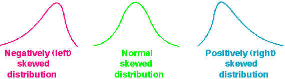
Typically, cost data in healthcare is right skewed, i.e. there are a lot of high cost cases, so the histogram looks more bunched on the left. This statistical concept is important to know because making comparisons across different datasets that are highly skewed affects the strength of your finding.
For example, the average cost of a procedure could be the same at Group A and B. But Group B’s costs may have a heavily right skewed, which means it is very likely that you will see higher costs cases from Group B than from Group A even though the average have been the same.
Other concepts
Outlier
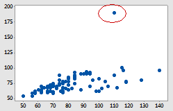 These are basically data points that are far away from the majority. Outliers can affect your analysis in a material way. E.g. a $1m cost hospital admission will push the average cost higher among a small group of admissions.
The way to identify outliers requires more statistical knowledge, I’ll write a future post about that. Please subscribe to make sure you don’t miss out.
Correlation vs causation
If you work in healthcare, you will hear the concept of “correlation vs causation”.
Correlation measures the degree to which two set of numbers are (co)related. A correlation of 1 means perfect positive correlation, -1 means perfect negative correlation, while 0 means no relationship at all. I look at the correlation between two set of numbers to decide whether further statistical analyses (e.g. regression) will be useful.
Causation develops the relationship idea further by asserting the directionality, i.e. you’re saying that one things causes another to happen. In practice, there are often a lot of complicating factors (confounders). Assessing causation is very difficult, and usually requires experimental studies with well thought out design, and usually over time to test whether one action leads to another.
What you need to remember is that just because you see things happening together, that does not mean one causes another, e.g. while all pregnant people are women, being women is the not what caused the pregnancy…
Seasonality
is referring to a predictable pattern that come and go over time. This is a key concept in public health/epidemiology. A commonly understood seasonality is the flu seasons before/during winter. But seasonality can occur along other time frames, e.g. Medicare beneficiaries renew their health plans at end of each year so you could see lower volume of treatment at the beginning of each year when plan deductibles reset .
When you analyze a set of data, look for seasonality and take these into account in your recommendations.
Linear regression
 is a basic statistical technique to test quantitatively how one set of numbers relates to another. This can be easily done in Excel (using formula or even easier in graphs) or any other statistical software. I run these simple linear regressions to decide whether time/resource investment in more advanced regression techniques will be useful.
Frankly, most non-statisticians already have a hard time understand linear regressions, so I need to be convinced that more advanced techniques will generate meaningful, actionable results that can be understood and appreciated by the client.
I will write more on these topics, practical applications in the near future. Subscribe to not miss out.

I think this is an excellent breakdown of the most common statistical jargon. It really provides a solid base for beginners/people looking to improve their skill sets. The terms are not just being used; but the understanding is also there.
LikeLike
Thanks Luke. Talk to you soon about one on one training 🙂
LikeLike